In
early 2020, Nike and the NFL started to unveil the new uniforms and updates for
7 teams. When the uniforms were first released everyone automatically had an
opinion of them including myself. However, it is very hard to judge a uniform
until you have seen it in gameplay. Now that the 2020 regular season is over, I
want to revisit the unveilings of each team and regrade them based on my
initial thought and now that we have seen most of the combinations used on the
field.
On April 08, 2020, the Atlanta Falcons introduced the world to their new Nike uniforms by going back to black. It was a complete uniform redesign, except they kept the existing logo. When they were first introduced, I graded the uniform an F. Below is what I liked and disliked about the new uniform:
Liked:
- Throwback uniform
- Silver facemask
with no silver anywhere else on the uniform
- Atrocious ATL on
the chest
- Same colored
socks for the home and away set
- Gradient
uniform
- Matte
helmet
Now that the season
is over, my grade for the uniform is a D-. I now understand the ATL on the chest
as that is how the residents of Atlanta refer to the city, still does not mean
I like it. The uniform did look better on the field than in pictures, however,
I will never be a fan of the same-colored socks as the pants and they wore the
all-black and all-white combinations way too much for my taste.
The uniform combinations that I thought looked good on the field of play were:
Week
13 vs the Saints,

Week 15 vs the Buccaneers

Week 17 at the Buccaneers
/cdn.vox-cdn.com/uploads/chorus_image/image/68627129/1294336477.0.jpg)
Liked:
- No more digital
alarm clock numbers
- Similar return
to my favorite uniform of all-time
- Black
facemask
- Near pewter like
pants with stripes
- Red jersey
- Pewter color
rush uniform
Now that the season
is over, my grade for the uniform is an A-. I thought I would like the Pewter
color rush uniform, but maybe it was the matchups with them, but they were not
great on the field. However, I still love this uniform update.
The uniform combinations
/cdn.vox-cdn.com/uploads/chorus_image/image/67651552/1280959991.jpg.0.jpg)

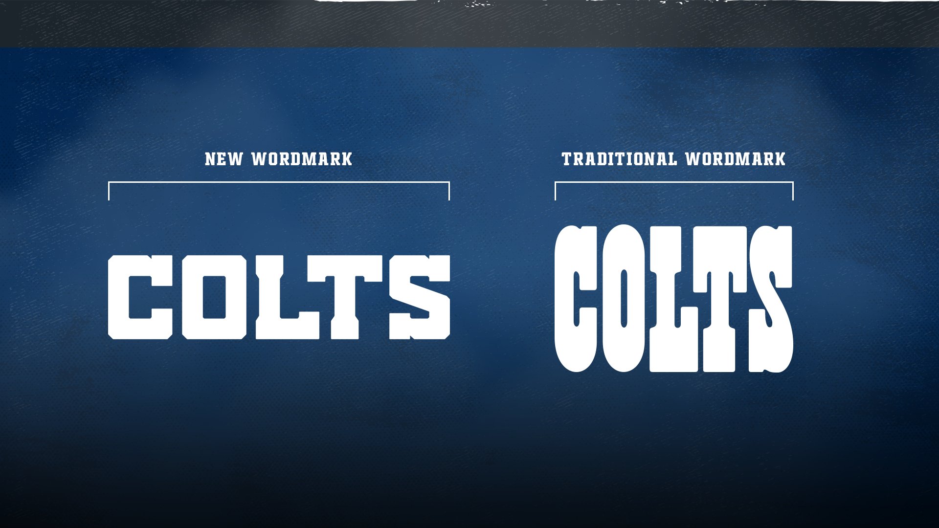
On April 13, 2020,
the Indianapolis Colts unveiled 5 updates to their current uniform design.
I initially gave the updates a grade of B+ as I love all the updates except for
leaving the facemask gray.
1) Changed
the number design on the uniform


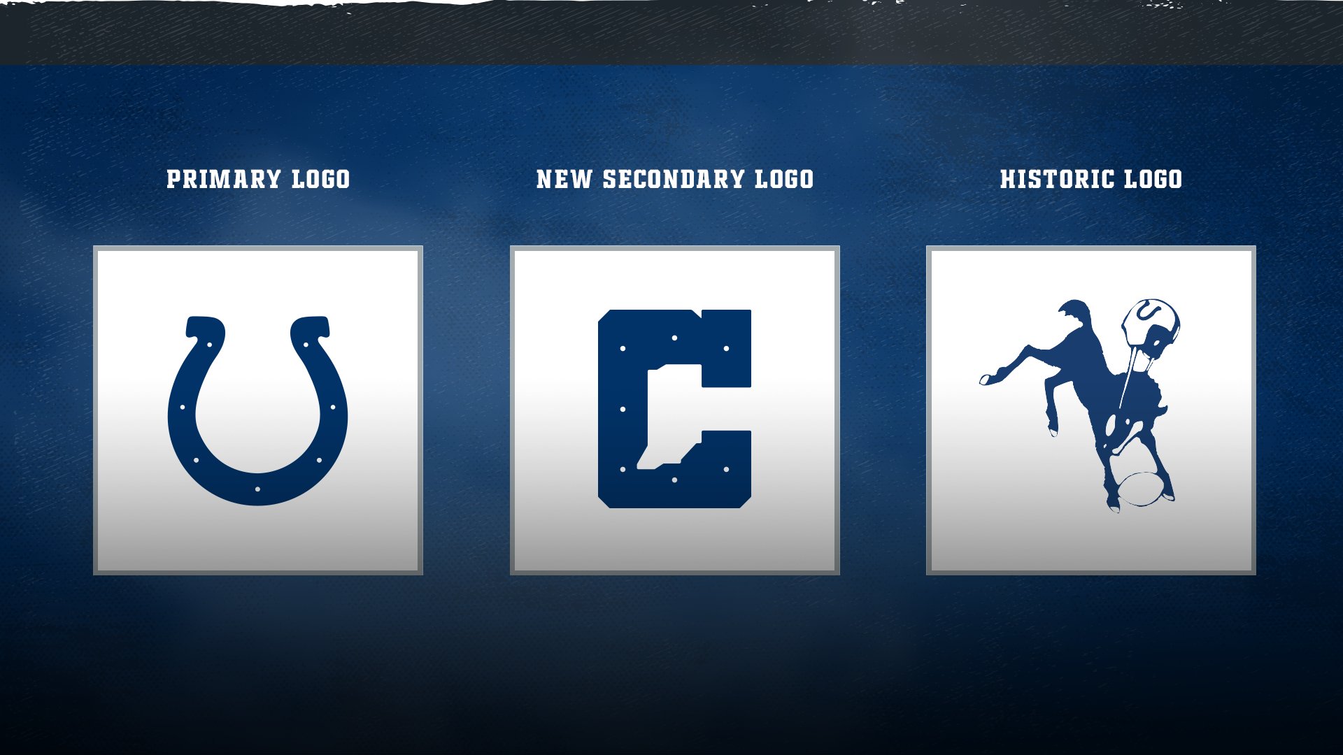

Now that the season is over, my grade for the uniforrm updates is still a B+.
Liked:
- Traditional
stripes on the jerseys
- Traditional
stripes on the white pants and the orange stripes on the brown road pants
- Kept the brown
facemask
Disliked:
- The all-brown
color rush alternate uniform
- No orange
pants
Now that the season is over, my grade for the uniform is an A-. Since the team introduced the orange pants in week 2, they looked amazing the rest of the year on the field except for the week 4 at Dallas when they wore the awful color rush brown uniform.
The uniform combinations that I thought looked good on the field of play were:
Week 1 at the Ravens:


Liked:
- New template
with stripes
Disliked:
- Lack of silver
and/or white pants
Now that the season
is over, my grade for the uniform is a C-. I still do not like the monochrome
look at home and really hope the team introducing silver pants next year to the
rotation.
The uniform combinations that I thought looked good on the field of play were:
Week 4 at the Chiefs:
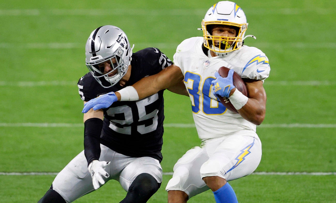
On April 21, 2020, the Los Angeles Chargers unveiled their new uniform redesign, logo and wordmark. Initially I graded the uniform an A as I thought the Chargers hit a hail Mary with their new set. This new uniform brought a lot of the past into a modern uniform and looking back it might have been too much. Below is what I liked and disliked about the new uniform:
Liked:
- Kept yellow
facemask
- Added numbers to
helmet
- Added yellow
pants
- Made powder blue
the primary home jersey
- Royal blue color
rush uniform
- New Logo
Disliked:
- Navy color rush
uniform
Now that the season
is over, my grade for the uniform is an A-. I did not like the navy color rush
uniform, but outside of that I thought the team looked fantastic on the
field.
The uniform combinations that I thought looked good on the field of play were:
Week 4 at Buccaneers:
/cdn.vox-cdn.com/uploads/chorus_image/image/67591964/1278456997.jpg.0.jpg)
/cdn.vox-cdn.com/uploads/chorus_image/image/68632993/usa_today_15392531.0.jpg)
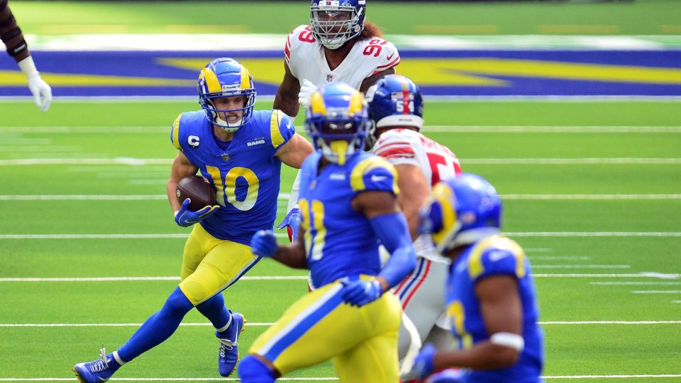
On
May 13, 2020, the Los Angeles Rams unveiled their complete uniform redesign including logos, wordmarks and color template. The unveiling was not good at all
as the team went with a modern look that bombed as I graded the uniform a D.
The only things that kept the grade from an F was the fact that I liked the new
shade of blue that the team introduced, and the facemask was blue. Below is
what I liked and disliked about the new uniform:
Disliked:
- Both new logos:
I thought the Rams head and LA logos looked like clipart designs
- Gradient numbers
- Gradient stripes
on the pants
- Gradient
logo
- Same colored
socks as the pants
- Bone colored
away uniform
- Lack of TV
numbers on the home jersey
- Lack of
uniformity in both the home and away jersey (the bone jersey had TV
numbers while the home jersey did not)
- Lack of
uniformity in both the home and away pants (the bone pants have 1 yellow
stripe, the yellow pants have a white and blue stripe, and the blue pants
have a white to yellow gradient stripe)
- The Los Angeles
Rams nameplate on the bone jersey (which was white and stood out like a
sore thumb)
- The whole
uniform looked like a patch job of multiple uniforms thrown
together.
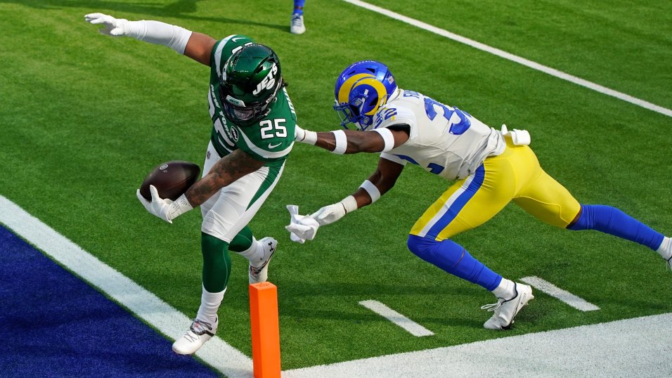
Now that the season
is over, my grade for the uniform is an F. Even though I love the new shade of
blue and the facemask is blue, I hated seeing this uniform on the field.
The uniform combinations that I thought looked okay on the field of play were:
Week 4 vs the
Giants:

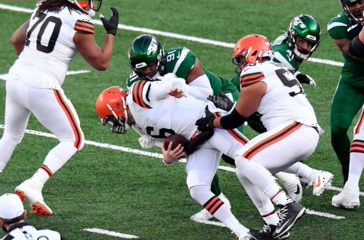
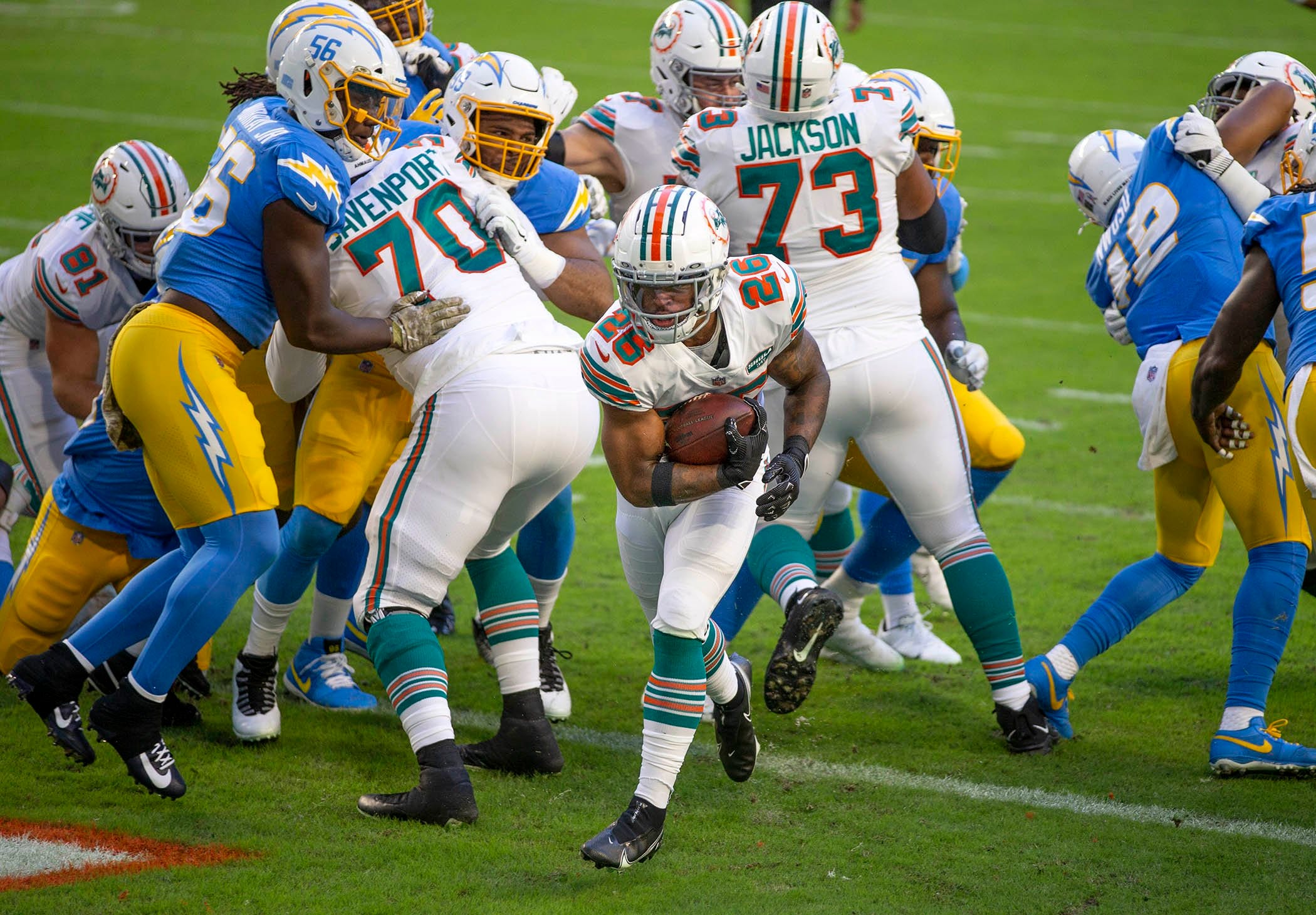
- Tampa Bay Buccaneers
- Cleveland Browns
- Los Angeles Charges
- Indianapolis Colts
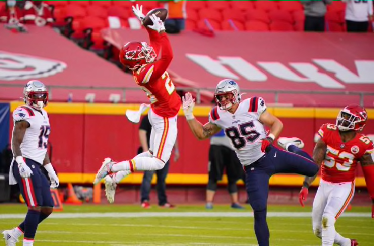
- New England Patriots
- Atlanta Falcons
- Los Angeles Rams
No comments:
Post a Comment