Showing posts with label Football. Show all posts

Wednesday, July 1, 2026

Georgia Tech Yellow Jackets - 2026 Under Armour Football Uniforms Review: 8.1


Georgia Tech Yellow Jackets Under Armour Uniform Review

Georgia Tech officially revealed its new Under Armour football uniforms, and this is a pretty big change for the program. They had been with Adidas, but now they’ve moved over to Under Armour on a 10-year deal, so this is the beginning of a new uniform era for the Yellow Jackets. Overall, I think this set is better than what Adidas had been giving them, but there are still some things I would change.

Starting with the white uniform, I like it a lot. The white helmet has the gold GT logo, a gold stripe, and a white facemask. It’s clean, it’s classic, and it feels like Georgia Tech. The gold helmet is strong too. The gold shell, gold facemask, and white GT logo outlined in navy is probably the most traditional-looking helmet in the set, and I think that works.

The white jersey is probably the best piece of the whole release. I really like the number font. The numbers are gold with a metallic gold drop shadow and navy outline, and that detail pops really well against the white jersey. The shoulder stripes are gold and navy with a metallic gold accent, and while I’m not completely in love with the shape of the striping, I do appreciate that they actually gave the uniform some character.

The striping pattern is inspired by the Kessler Campanile, which is an 80-foot tower on Georgia Tech’s campus. I can see that inspiration more clearly on the pants stripe than I can on the shoulder stripe, but I still don’t mind the idea. At least they tried to connect the uniform to campus identity instead of just throwing random stripes on it.

The white pants are excellent. I love that they have a real stripe. I’ll never be a fan of plain football pants, so anytime a team gives me a good pants stripe, I’m going to appreciate it. The white pants with the gold stripe and navy accent look sharp. I’d give the white pants alone a 9 out of 10.

The gold jersey is where I start to struggle more. The basic idea is fine. It has the same general striping pattern with white, navy, and metallic gold, and the numbers are white with a metallic gold drop shadow outlined in navy. But the problem is the gold jersey itself. It doesn’t really look like a rich football gold to me. It has that flat, modern uniform finish, and when you put a metallic gold accent on top of a flatter gold base, the two don’t always work together.

That’s one thing I miss about older football uniforms. Back when manufacturers like Reebok used shinier materials, gold actually looked like gold. It had some sheen to it. These newer matte-style fabrics can make gold look dull or even a little tacky depending on the lighting. The metallic details pop, but they also make the base gold look weaker by comparison.

The gold pants are okay. They have a white stripe with a navy accent, and I like that they didn’t leave them plain. But they’re not anything special. They work, but they don’t wow me. I’d probably give the gold pants a 6 out of 10.

Now, the worst part of the set is the dark gray pants. I do not understand this choice. Georgia Tech uses white, gold, and navy as its main colors, and navy is already used throughout the uniform as an accent. So why not just make those pants navy? The dark gray pants look out of place. They don’t feel like Georgia Tech to me. They drag down the whole set. If I rated those pants by themselves, they’d be a 1 out of 10.

The good news is that the overall direction is better. Under Armour gave Georgia Tech a more complete identity than Adidas had, and I like that they leaned into white, gold, campus inspiration, and traditional GT elements. The white jersey is strong. The helmets are good. The pants striping is a plus. The number font works, especially on white.

But I still wish they had gone all-in with navy pants instead of dark gray, and I’d love to see a true navy jersey added to the rotation. That would make the set feel more complete.

Overall, I like where Under Armour went with this. It’s not perfect, but it’s an improvement.

Final rating: 8.1 out of 10.

The white uniform is really good, the gold has potential, but the dark gray pants are a major miss.


Tuesday, June 30, 2026

Northwestern Wildcats 2026 Alternate Review


Now that I’ve seen the full uniform, I still feel like this is a solid one-off or alternate look, but definitely not something I’d want Northwestern wearing every week.

The best part of the uniform is the purple. That shine really stands out. I don’t know if it’s the lighting, the fabric, or a mix of both, but the purple has that glossy, almost metallic look to it. That’s something I miss in football uniforms. So many modern uniforms have gone flat or matte, so seeing a uniform with this much shine gives it some life.

I also really like the helmet. The purple shell looks great, the black facemask works, and the Northwestern “N” with the gold outline pops really well. The helmet stripe is strong too with the gold, black, and purple combination. From a distance, the helmet might be the cleanest part of the whole set.

The striping is another positive. I like the idea of using Northwestern’s traditional stripe pattern and giving it a Gothic twist. The pants especially work for me. The purple pants with the gold and black stripe look sharp, and the Gothic design inside the stripe adds detail without completely taking over the uniform. It’s busy, but not terrible.

Where I struggle more is with the shoulder stripes. I like the color layout, but putting “Northwestern” on one shoulder and “University” on the other feels like too much. It’s one of those details that makes sense with the theme, but visually I don’t think it improves the uniform. It almost feels like they were trying a little too hard to make sure everyone noticed the Gothic concept.

The number font is probably my biggest issue. I understand what they were going for, and it definitely matches the Gothic theme, but I’m just not a fan of how it looks on a football jersey. The gold texture is nice, and the black outline helps it stand out, but the actual shape of the numbers feels awkward to me. The number 6 especially looks more like a design piece than a football number.

The nameplate font is interesting. I actually think it works better than the number font. The Gothic lettering for the player names feels more natural because names can handle that decorative style better than numbers can. It still may not be something I’d want every week, but for this uniform, it fits.

The small Northwestern University badge on the front left leg is okay. It’s not my favorite detail, but the black and gold does pop against the purple. I don’t hate it. I just don’t think it’s necessary.

The arm logos are solid. The black Northwestern “N” outlined in gold and purple looks pretty good, and it ties the helmet, jersey, and pants together. That part feels clean and intentional.

Overall, I think this uniform has some really strong individual pieces. The helmet, purple shine, striping, and color combination are all positives. But the number font, shoulder wording, and extra Gothic details keep it from being great.

As a one-off alternate, I like it. As a regular uniform, no chance.

Final rating: 6 out of 10.


Wednesday, January 14, 2026

Atlanta Falcons - 2026 Uniform Concept

Main Logo: 


Stripes Pattern used throughout uniform: 


Home Main: 


Road Main: 


Home Alt 1: 


Home Alt 2: 


Away Alt 1: 


Home Alt 3: 


Tuesday, January 10, 2023

2022 NFL Uniform Game Matchups - Year in Review

First and foremost, thank you to all members that participated in the surveys this year. We had 790 responses this year with each weekly survey averaging over 44 responses. 

Before the start of the year, 12 teams introduced alternate helmets and throwback uniforms, while the Washington Football Team changed their name to the Commanders and introduced 2 new helmets along with new uniforms. 

Arizona Cardinal - Black Helmet, with White pants & Black pants

Atlanta Falcons - Throwback Helmet & Uniform

Carolina Panthers - Black Helmet & Uniform

Chicago Bears - Orange Helmet & Uniform

Cincinnati Bengals - White Helmet & Uniform

Dallas Cowboys - Throwback Helmet & Uniform, Alternate White Helmet & Uniform, Red Stripe Helmet & Uniform

Houston Texans - Red Helmet & Uniform

New England Patriots - Throwback Helmet & Uniform

New Orleans Saints - Black Helmet & Uniform

New York Giants - Throwback Helmet & Uniform

New York Jets - Black Helmet & Uniform

Philadelphia Eagles - Black Helmet & Uniform

Washington Commanders - Burgundy & Black Helmets, and New Uniforms

The biggest movers in a positive direction in 2022 from the 2021 results were as follows

1. Los Angeles Rams moved up 14 spots from #27 to #13.

2. Pittsburgh Steelers moved up 8 spots from #10 to #2. 

3. Indianapolis Colts moved up 8 spots from #16 to #8. 

The biggest movers in a negative direction in 2022 from the 2021 results were as follows

1. Denver Broncos moved back 14 spots from #14 to #28.

2. Washington Commanders moved back 8 spots from #19 to #27.

3. Baltimore Ravens moved back 7 spots from #12 to #19. 

4. Cleveland Browns moved back 7 spots from #5 to #12. 

The highest rated games of the year were as follows: 

1. Steelers at Dolphins Week 7 - 9.24 

2. 49ers at Raiders Week 17 - 9.15
3. Raiders at Steelers Week 16 - 9.14
The lowest rated games of the year were as follows: 

1. Broncos at Jaguars Week 8 - 2.872
2. Broncos at Seahawks Week 1 - 3.06
3. Falcons at Commanders Week 12 - 3.25

Team with the most 1st place finishes in 2022

Pittsburgh Steelers (5) 
  • Week 03: at Browns 9.00
  • Week 07: at Dolphins 9.24
  • Week 08: at Eagles 8.11
  • Week 16: vs Raiders 9.14
  • Week 18: vs Browns 8.71
Teams with the most 2nd place finishes in 2022
  • Bears - 4
  • Chiefs - 3
  • 49ers - 3
Teams with the most 3rd place finishes in 2022
  • Giants - 4
  • Chiefs - 3
  • Packers - 3
  • Vikings - 3
Team with the most last places finishes in 2022

Broncos:
  • Week 01: at Seahawks 3.06
  • Week 08: at Jaguars 2.87
  • Week 10: at Titans 3.65
  • Week 15: at Broncos 3.91
Falcons:
  • Week 02: at Rams 3.94
  • Week 03: at Seahawks 3.60
  • Week 12: at Commanders 3.25
  • Week 16: at Jets 4.14
Teams that failed to finish in the Top 3 at least once in 2022
  • Arizona Cardinals 
  • New York Jets
  • Tennessee Titans
  • Denver Broncos
  • Washington Commanders
  • Jacksonville Jaguars
  • Seattle Seahawks
  • Carolina Panthers
Highest rated matchups over the last 5 seasons: 

2021 - Packers at Chiefs Week 9 - 9.23
2020 - Chiefs at Raiders 9.45

2019 - Packers at Chiefs 9.52

2018 - Chiefs at Raiders 9.06

2017 - 49ers at Rams 9.06

Lowest rated matchups of the past 4 seasons

2021 - Eagles at Jets Week 13 - 3.03


2020 - Lions at Falcons 2.04


2019 - Browns at Broncos 2.93 

2018 - Buccaneers at Ravens 2.88

2017 - Rams at Jaguars 2.13


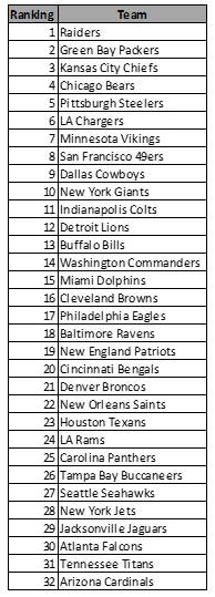
2018-2022 Standings: